
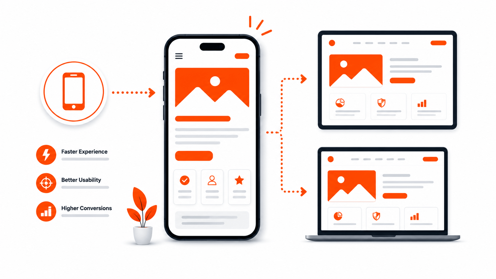
Most people think mobile-first design means making sure your website looks good on a phone. That is not wrong, but it is incomplete. By 2026, mobile-first is not a design philosophy. It is a survival requirement. And most websites are still getting it wrong in ways that quietly cost them customers every day.
Here is what mobile-first actually means, where businesses are falling short, and what it takes to get it right.
The Numbers Are Not Subtle
Global mobile internet usage has been above 60% for years. In Kenya, the Communications Authority reports that mobile data subscriptions dominate internet access, with the vast majority of Kenyan internet users never touching a desktop. Statista projects that mobile will account for over 65% of all web traffic worldwide in 2026.
This is not a trend anymore. It is the baseline. If your website was designed on a desktop and then adjusted to fit a phone screen, you are building for the minority of your users and patching the experience for the majority.
Mobile-First vs Responsive: They Are Not the Same
This distinction matters more than most people realize.
Responsive design means your website adapts to different screen sizes. The layout shifts, images resize, and columns stack. That is better than nothing, but it is still a desktop experience squeezed onto a smaller screen.
Mobile-first design means you start with the mobile experience and build outward. You make decisions about content hierarchy, navigation, and functionality based on what a mobile user needs first. Then you enhance for larger screens.

The difference shows up in the details. A responsive site might hide a complex navigation menu behind a hamburger icon on mobile. A mobile-first site would never have designed that complex navigation in the first place, because it recognized from the start that most users would never see it expanded.
Responsive is a technique. Mobile-first is a mindset. You can have responsive without being mobile-first, and it shows.
What Mobile-First Actually Requires in 2026
Making your site work on mobile in 2026 goes beyond layout. Here is what it genuinely takes.
Content designed for scanning, not reading
Mobile users do not read. They scan. They are on a bus, in a queue, or between meetings. They have seconds, not minutes. Your content needs to lead with the answer, not build up to it. Paragraphs should be short. Headings should be specific. Every word should earn its place.
If your hero section requires three paragraphs of text to communicate your value proposition, it will not be read on mobile. Compress it or lose it.
Touch targets that actually work
Google’s mobile UX guidelines recommend touch targets of at least 48 by 48 pixels. Many sites still cram links and buttons together with tiny tap zones. On a phone, that means the user taps the wrong thing, gets frustrated, and leaves.
Buttons should be large enough to tap with a thumb. Links should have enough spacing that you do not accidentally hit the one next to it. Forms should be easy to fill out with one hand.
Performance that respects mobile data plans
This is the one that gets ignored the most. A beautiful site that loads 4MB of images and scripts is not mobile-first. It is mobile-hostile.
In Kenya, many users are on limited data bundles. A page that takes 8 seconds to load on a 4G connection is not just slow. It is actively costing your users money they did not agree to spend. Compress images. Lazy load content below the fold. Use modern image formats. Cut unnecessary scripts.
Google PageSpeed Insights will give you a performance score, but the real test is loading your site on a mid-range phone on a regular mobile connection. If it feels fast there, you are in good shape.
Navigation that makes sense with one thumb
Mobile navigation is not just about making the menu smaller. It is about understanding how people hold their phones. The bottom of the screen is the easiest area to reach with your thumb. The top corners are the hardest. Navigation that puts critical actions at the top right of the screen is reaching for the hardest possible target.
Mobile-first navigation puts the most important actions where they are easiest to reach. That might mean bottom navigation, sticky call-to-action buttons, or a simplified menu structure that reduces the number of taps needed to get anywhere.
Forms that do not punish mobile users
Filling out forms on a phone is painful. The best mobile-first sites minimize form fields, use the correct input types so the right keyboard appears, and avoid dropdowns that are difficult to interact with on touch screens. Every additional field in your contact form is a potential abandonment point.
If your lead generation form has twelve fields, most mobile users will not fill it out. Ask yourself what you actually need at this stage and cut the rest.
The Business Impact
This is not theoretical. Mobile UX directly affects revenue.
Google’s research on mobile page speed found that as page load time goes from one second to five seconds, the probability of bounce increases by 90%. A study by Baymard Institute on checkout UX found that complex, difficult-to-use mobile checkout flows are among the top reasons for cart abandonment.
Your website is not losing customers because your product is bad. It is losing customers because the mobile experience makes it too hard to buy.
Mobile-First and SEO
Google has used mobile-first indexing since 2019. That means Google predominantly uses the mobile version of your site for indexing and ranking. If your mobile site has less content, broken elements, or a degraded experience compared to your desktop version, your rankings suffer.
There is no separate mobile SEO and desktop SEO. There is just SEO, and Google evaluates your mobile site. If your mobile experience is weak, your search visibility is weak.
How to Audit Your Mobile Experience
Open your website on your phone. Not your developer’s phone. Not an emulator. Your actual phone, on a regular mobile connection, not Wi-Fi.
Ask yourself these questions:
- Does the page load in under three seconds?
- Can you understand what the business does within five seconds of landing on the page?
- Can you navigate to any page without zooming in?
- Can you tap every button and link without accidentally hitting something else?
- Can you fill out the contact form without wanting to throw your phone?
If the answer to any of these is no, you have work to do.
Where We Come In
Mobile-first design is not an add-on. It is the starting point. At Uppfy, we design and build websites starting from the mobile experience, because that is where most of your users are. If your current site was built desktop-first and it shows, we can help you fix that.
You can learn more about our web design and development services, or reach out directly and we will take a look at what you have and tell you honestly what needs to change.
The mobile experience is not a secondary version of your website. For most of your users, it is the only version they will ever see. Make it count.